05/21/14 09:28
Inkflow 3.7, with the Write-Behind Highlighter
Inkflow was designed and built with one over-arching goal: To be as seamless a tool as possible between your mind and the screen. The idea is that if the tool can get out of the way enough, and let you project what you have in mind on to the display, then magical things can happen.
We've worked hard to make the writing and drawing experience smooth and fast, even on older hardware. We've also struggled mightily to keep the controls simple yet powerful. While we've added quite a number of tools and enhancements over the years, we've made sure that none of them detract from the uncluttered interface you know and love.
So, How About Layers?
We love hearing your feedback, and we do get a lot of it, thanks! A feature a lot of people have been asking for is layers. Now, everyone knows what a layer control looks like: A stack of transparent paper that you can draw on independently. Every pro graphics App since Photoshop has one. It might seem straight forward to add one to Inkflow.
Here's the problem: Layer controls add a lot of complexity.
Not only do they add an advanced layer of abstraction you need to keep in mind (“Um, what layer am I drawing on?”), they are also difficult to operate (“Hide layer 2, and lock layer 3”). It takes a lot of taps. Having them would detract a lot from a seamless experience.
Calling the Underwriting Department
So, we dug deeper. It turns out that while there are many things folks want to use layers for, the most common one is to draw behind what's already on the page.

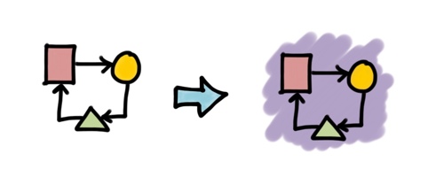
So, we created a new tool to Inkflow Plus: The Write-Behind Highlighter (we almost called it the under-lighter). It draws behind existing ink, and feels very natural to use. So natural in fact, that you will start wishing real pens could do this.

This is useful for more than just highlighting of course. It's great for coloring in diagrams too. You'll normally start a diagram with the outline, and then color in parts of it. The new Highlighter tool makes it easier to color within the lines (if you're into that), or beyond them.
It's also handy for adding a quick back-splash or shadows to a diagram.

You'll find the new highlighter tool as the 5th tool in the updated palette. It's a free addition for all Inkflow Plus users, new and existing. Just because we love you guys!

Every Day Better Than the Last
So there you have it, one more shiny tool in your toolbox. What will you create with it?
We also rounded off this update with a cleaner palette interface that sports matching tint colors. At first, the iOS7 look felt too stark, but now we can't help but gasp in plasticky horror when we look at the old iOS6 UI.
As always, thank you so much for your continued support. We don't have a big marketing budget (nor even a small one for that matter), and we absolutely rely on our fans to spread the word about our work.
We’ve built a whole range of Apps that are focused on making your creative work just a little easier. Check out what's new, and maybe pick up a few more today.
Also, the App Store has recently shifted to placing even more importance on reviews for App visibility. Each update is actually rated separately, and will drop in the rankings if there aren't new ratings (yes, it's kind of a silly algorithm).
So, if you have a moment, please consider rating us again. It takes less than a minute. We also love hearing your feedback, and it means more to us than you realize.
Thanks!
If your iPad hasn't already auto-updated, go get Inkflow 3.7 here.
Related: Inkflow.